I recently participated in a contest hosted by Telegram to backport Liquid Glass to earlier versions of iOS (edit: I got second place).
Despite a tight timeline being due the day after Christmas, I’m happy with what I
was able to submit. I think my approach is particularly innovative and I discuss it below.
You can check out the full code on Github.
The Problem
The challenge was to create custom implementations of several UI elements that mimicked
the Liquid Glass effect of iOS 26, and worked all the way back to iOS 13. In addition to
aesthetic accuracy and appeal, submissions would be evaluated on performance, memory
consumption, and battery impact.
This last point presented a problem because, while the Liquid Glass effect can be
implemented as a Metal shader, there’s no supported way to apply a shader directly
to a UIView (outside of SwiftUI-only APIs introduced in iOS 17).
One possible workaround is to drive the effect using a CADisplayLink, where, on every
frame, we snapshot the view hierarchy and apply a shader to the resulting image. While
technically possible, though, this approach puts significant stress on the CPU and is far
less efficient than effects that integrate directly with Core Animation’s render
pass.
Because of this I decided not to use Metal shaders at all. This seemed to be the right
choice, but if other contestants got them to work efficiently, I’d be very curious
to know how they did it.
Taking Inspiration from Metaballs
I decided instead to approximate the Liquid Glass effect by taking inspiration from a
technique for making metaballs. While not as visually accurate as a shader-based approach, this method is far more
efficient, which I think is a worthy tradeoff given the constraints of the contest.
Here’s how it works:
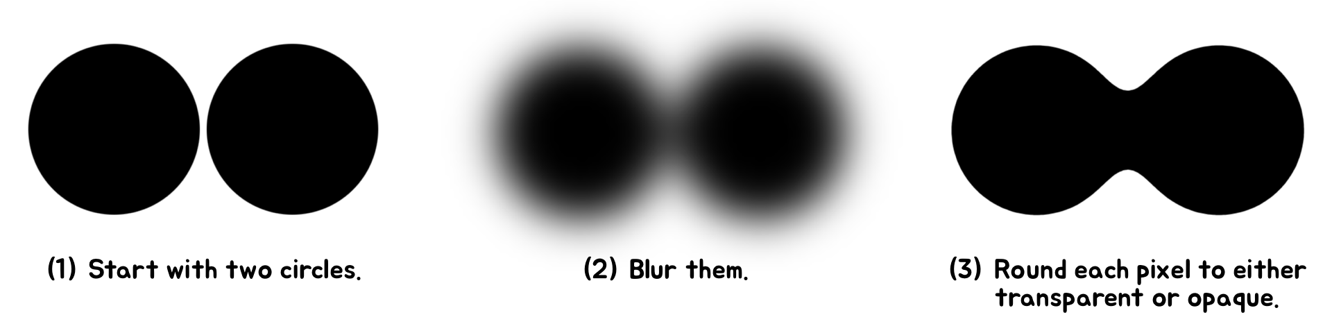
In this simple example we see how the effect creates a smooth, liquid-like appearance, as
if the circles (or metaballs) were merging together. We’ll adapt this technique to
mimic the distortion effect of Liquid Glass, but first we must implement the technique
itself. For that we turn to the arcane magic of CAFilter.
CAFilter is a powerful but private API used for applying filters to Core Animation layers.
Every UIView is backed by a CALayer, so it works out of the box with UIKit. And unlike
custom shaders, CAFilters are applied directly to the render pipeline, making them very
efficient.
The only issue is that, because CAFilter is a private API, there’s no official
documentation on how to use it, making it a bit of a black box to work with. Officially,
private APIs are not allowed in apps submitted to the App Store. However, the contest
explicitly allows their use, and Telegram already uses them in other parts of the app, so
I considered it reasonable to incorporate them into my solution.
This Github repository provides a great starting point for seeing the types of CAFilters available.
If we look closely, two stand out as being particularly useful.
First is the Gaussian blur filter. This one is straightforward to understand, as it just
blurs the layer it’s applied to. It accepts a number of parameters, but the most
important is inputRadius, which controls the amount of blur. The blur filter is a commonly
used CAFilter and Telegram already has helper methods for creating it.
The second is the alpha threshold filter. This filter is much lesser known; in fact, I
haven’t even seen it mentioned anywhere before. It works by making pixels
transparent if their alpha value is below a certain threshold, or opaque if above it. A
parameter called inputAmount determines this threshold, and another called inputColor
determines the color when pixels are opaque.
Basically, the Gaussian blur softens the edges of the views, and the alpha threshold
sharpens them back up. And if we set the threshold to 0.5, nonoverlapping edges will be
identical to how they appeared before the filter was applied. This means a metaball on its
own appears as an unaffected circle.
All we have to do now is assign these filters to a container layer, configure their
properties, and all sublayers (and subviews) will be rendered with the effect. And because
this work is GPU-accelerated, it remains snappy and efficient when animated.
Making a UISwitch
With the metaball effect in place, we can adapt it to UI elements. We’ll start with
a simple one: a UISwitch.
I’ll go over each step in detail, but I’ll start by showing an overview of the
whole process:
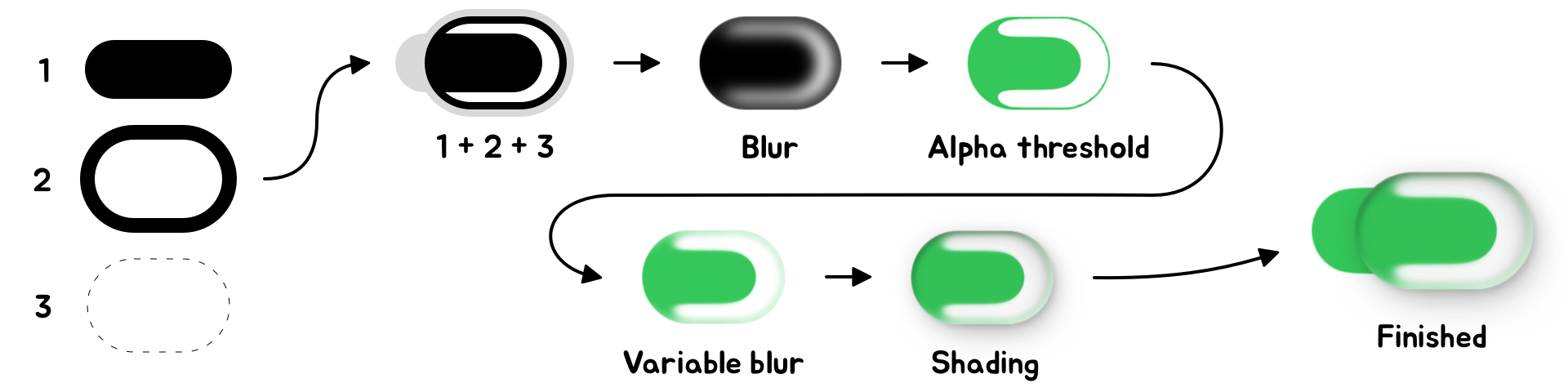
The first few steps should look familiar, but notice the shapes are now different. Instead
of two circles we use two pill shapes: one that’s filled in, and another
that’s just an outline. These are labeled 1 and 2 in the diagram, respectively.
These pill shapes are added to a container view, labeled 3, that clips its content into
yet another pill shape. We apply the blur and alpha threshold filters to this container
view.
The alpha threshold produces a shape with sharp edges, so in the next step we make them a
bit softer. To do this we add a third filter to the container view, called a variable
blur.
The variable blur is a lot like the blur we’re already familiar with. It accepts a
parameter called inputRadius that determines the amount of blur, but it also accepts a
parameter called inputMaskImage. The alpha channel of this image determines how much blur
to apply at each pixel: opaque pixels are fully blurred, and transparent pixels
aren’t blurred at all. For the switch, we apply a mask image that is black (blurred)
towards the edges and transparent (not blurred) towards the middle.
The next step is to add shading. This part is straightforward: all shadows and highlights
are baked into a single image and added as a UIImageView right on top of everything. The
image view is composited using a multiply blend mode.
Prerendering the shading has several advantages. We can add as many shadows as we want,
and there will be no performance cost over that of the image itself. Moreover, if we load
the image from an asset catalog, we can specify an alternative version that will be used
in dark mode. The downside is that we must know the size of the image in advance, but this
isn’t a problem: UISwitches have a fixed size.
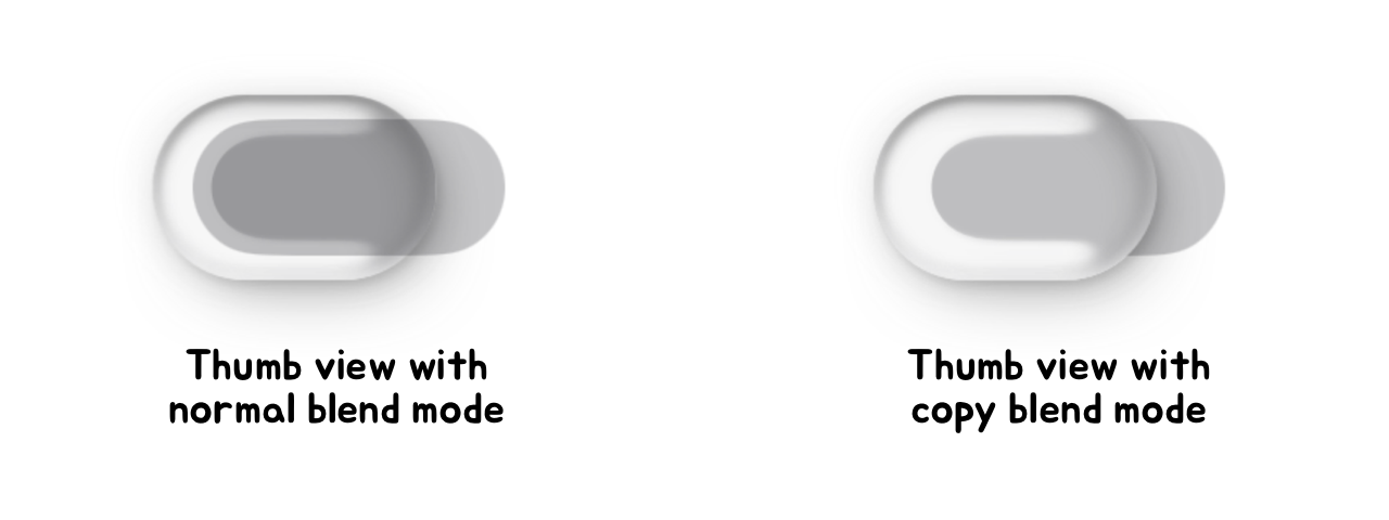
The last step is to add the track view. This is just a UIView with a background color
that’s added beneath the thumb view we just created. However, we want the thumb view
to erase the portion of the track it covers. To do this, we set the thumb view’s
blend mode to copy. This makes the thumb view completely replace the pixels it covers,
effectively cutting a hole in the track below it.
This completes the visual portion of the switch. This is only half the work in its
implementation; the other half is making it interactive. I’ll briefly outline that
process here, noting that the animations are all driven by a CADisplayLink as opposed to
CAAnimations.
Telegram uses CAAnimations in many other parts of the app, but I don’t think
they’re the best tool for this specific problem. CAAnimations work best as
“fire and forget” animations. Rather, our switch must be interactive and
interruptible, with state that’s a function of multiple concurrently running timing
curves.
To fully model the motion of the switch I used four independently running spring
simulations. Each one was updated each frame according to the closed-form analytical
solution of a damped harmonic oscillator. I chose to advance the simulations using a fixed
timestep as opposed to the variable delta between frames; this makes the animation pause
as opposed to skipping ahead in the event of a dropped frame. I find this behavior less
visually jarring.
The first spring drives the horizontal position of the thumb view. When the switch is
dragged, we update the target of this spring—not the position itself—and let
it continue to animate towards its target. This gives the thumb a nice, liquidy feel that
seems to “chase” the user’s finger. It also damps its velocity, which
will be important later. When the user finishes dragging, we set the target to the on or
off position and let it animate to completion.
The second spring drives the scale of the thumb view. We scale up the thumb when the
switch begins tracking a touch, and scale it back down when the touch finishes. We also
use a timer to enforce a minimum duration from when the thumb scales up to when it scales
back down. This ensures the thumb still animates in the event of a very quick tap on the
switch.
The third spring drives the jiggle of the thumb view. We stretch the thumb horizontally in
proportion to the spring’s value, and vertically in proportion to its inverse. This
gives the thumb a nice, bouncy feel as it moves. The target of this spring is updated each
frame according to the velocity of the first spring, meaning the faster it’s
dragged, the more it jiggles. Note that, because of this dependency, special care must be
taken to ensure the springs are updated in the correct order.
The final spring drives the color of the track. Rather than interpolating the RGB values,
we composite the on color over the off color for an interpolated alpha value. This
produces more accurate in-between colors when the off color is semitransparent. Updating
the color requires updating the inputColor of the alpha threshold filter. This is another
advantage of animating with a CADisplayLink: animating properties of CAFilters can be
unreliable with CAAnimations.
Making a UISlider & UITabBar
The Telegram contest also called for a custom UISlider and UITabBar. I made these using a
process very similar to that of the switch, so I’ll only comment on a few points of
interest.
First off, up until this point, I haven’t emphasized an important detail of the
alpha threshold filter: it doesn’t preserve colors.
Let’s revisit the metaball example to see what I mean:
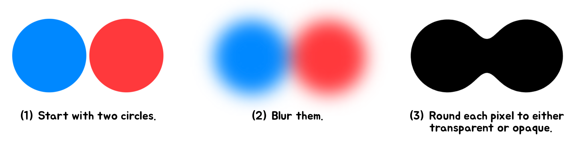
This isn’t an issue when the view contains only one color; we just set the
inputColor to the original color of the view. But for the UISlider, there are two colors
we need to consider: one for the track’s background, and another for the part
that’s filled in.
To solve this, we basically do the metaball effect twice—once for each
color—then layer the effects on top of each other. I found this to be an effective
approach, but it highlights a weakness of this technique for approximating Liquid Glass:
it doesn’t scale well for views with multiple colors.
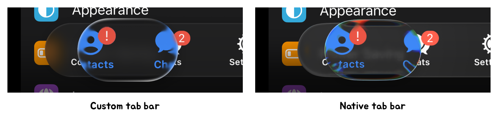
We encounter this problem again with the tab bar, which can contain up to three colors:
one for the symbols and text, and another two for the badge that can appear in the corner.
In this case I solved the problem a different way. We only apply the metaball effect for
the color of the symbols and text. Then, on top of that, we add the views again, but
without any filters. This brings back the original colors and sharpness. Finally, we apply
our variable blur and shading to the entire hierarchy.
In none of our examples have the limitations of the metaball technique been a dealbreaker.
We control the layers the effect is applied to, letting us make strong assumptions about
their content and colors. This wouldn’t be possible if we applied the effect to an
arbitrary background view, for example. In this case we would need a different approach.
Overall, I think this is a powerful technique for approximating Liquid Glass. While not
accurate to the pixel, it is visually convincing, maintainable, and efficient enough to
run smoothly on older devices. This efficiency, coupled with a spring-based animation
system using CADisplayLink, allows us to replicate the fluid interactivity of Liquid
Glass, which contributes greatly to its overall feel.